Seats First Booking Test
User Test showing that seats first is the best option
Seats First
Problem:
The current flow for buying tickets is too long and confusing.
Our marketing team found that we were losing a lot of customers during our booking flow on our app. This was due to the fact that our flow was too long and confusing.
We also found that a lot of our users were leaving because of crowded theatres.
Solution:
Create a new flow that shows the seatmap first and combines to screens to make the process faster.
I created a user test with three different flows to see which flow users preferred.
I used a non-branded approach to try to stay away from any brand loyalty biases.
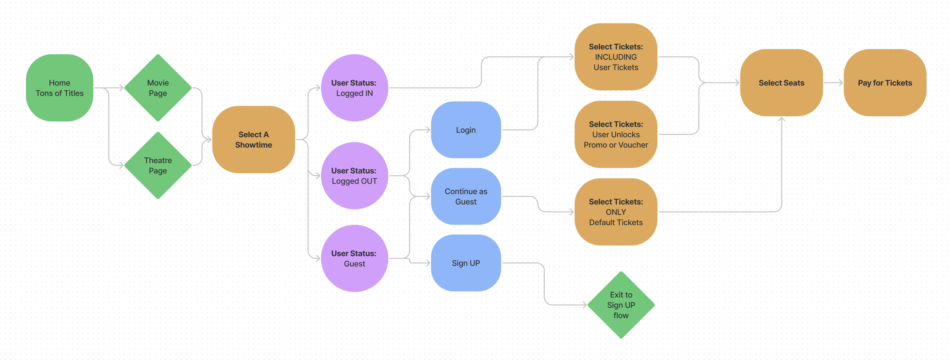
Current Flow
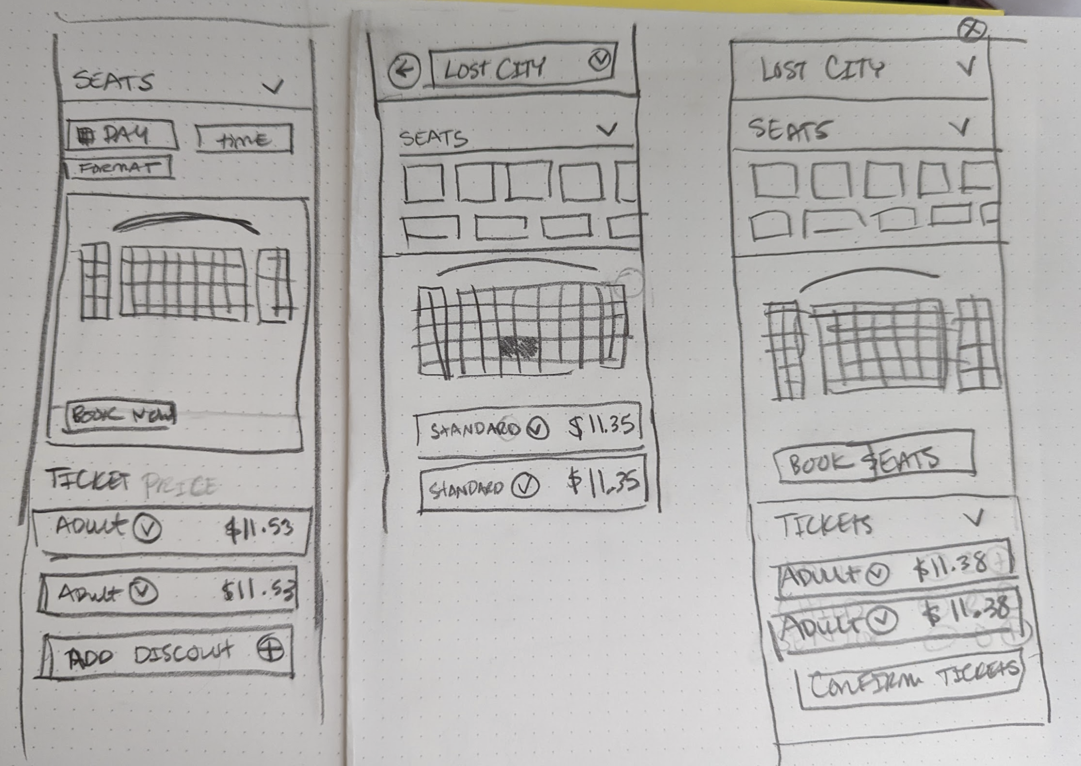
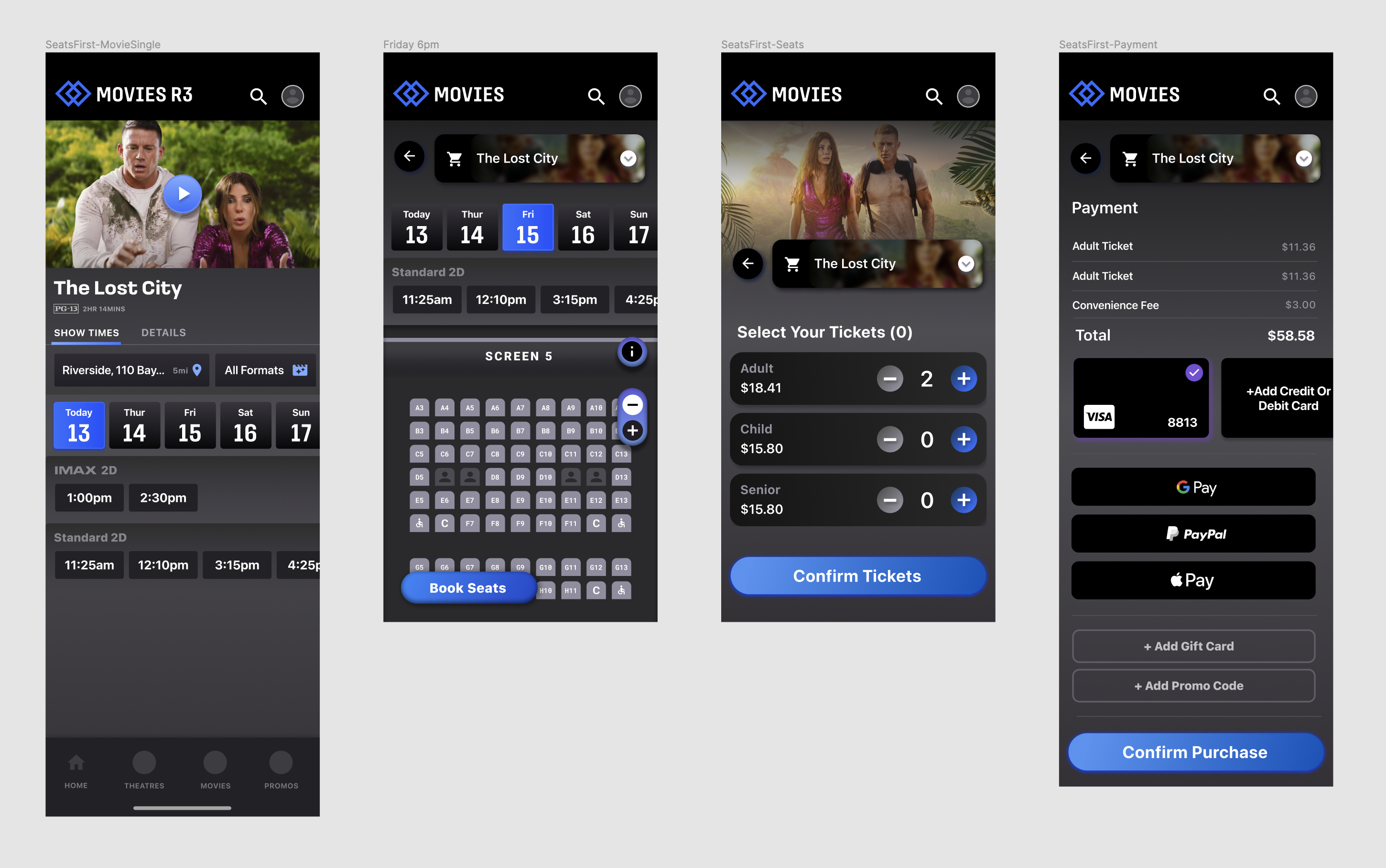
Users select seats and Tickets
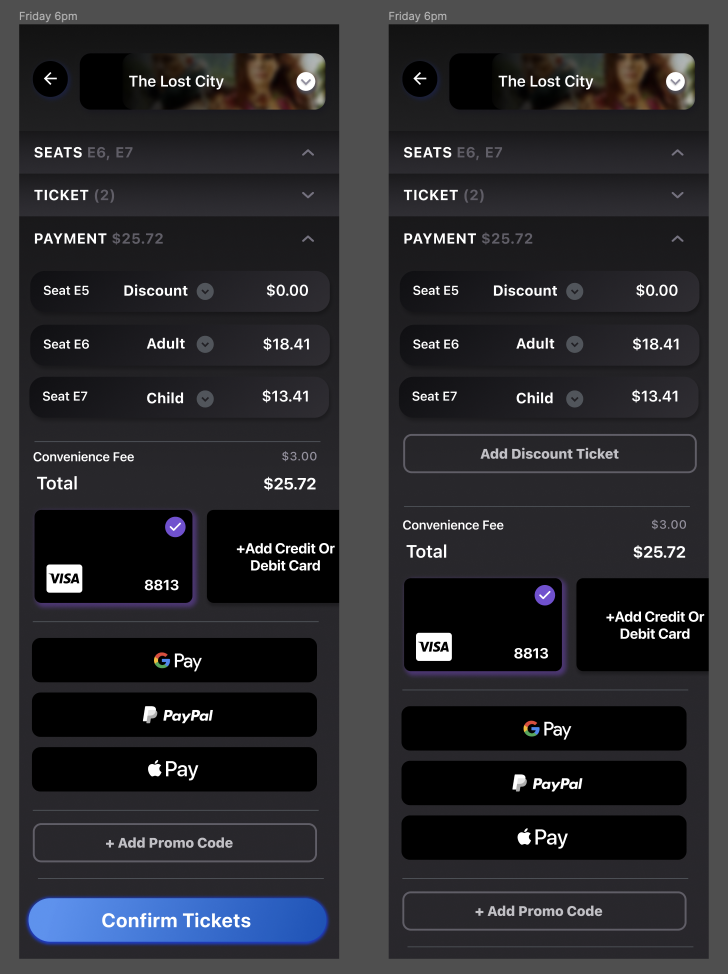
Users select their tickets and their seats separately, which takes more steps to complete. Also, the process becomes more complicated when a user has discounted tickets.
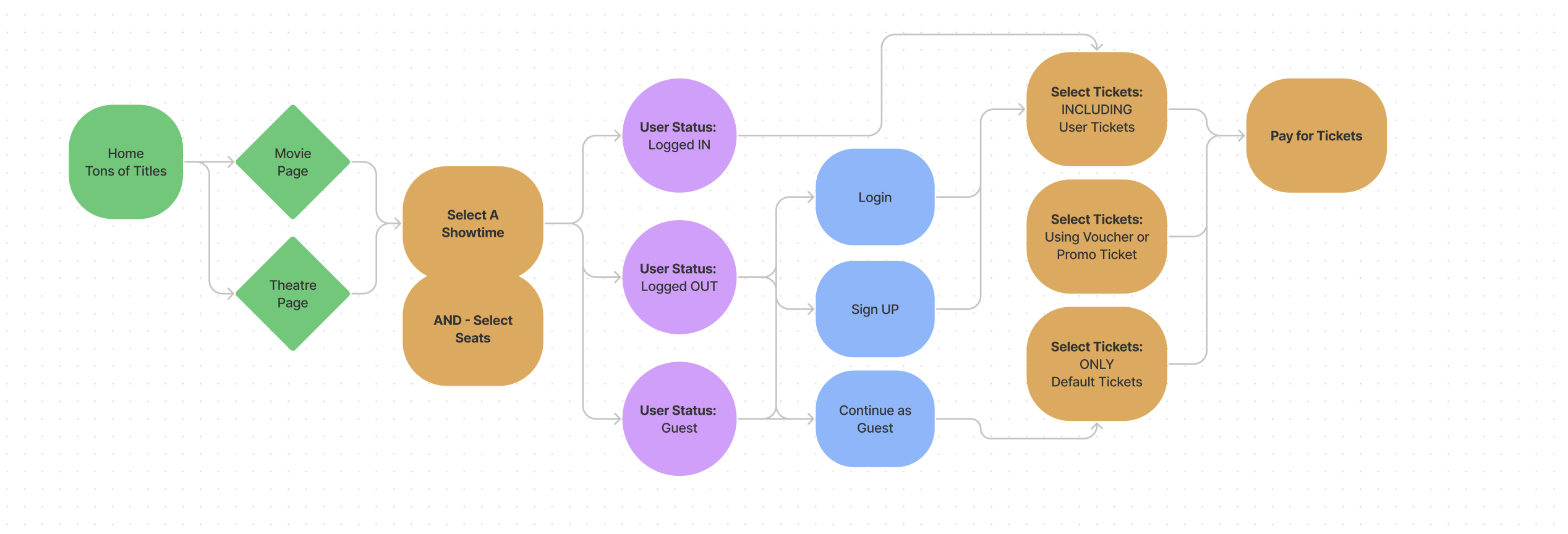
New flow
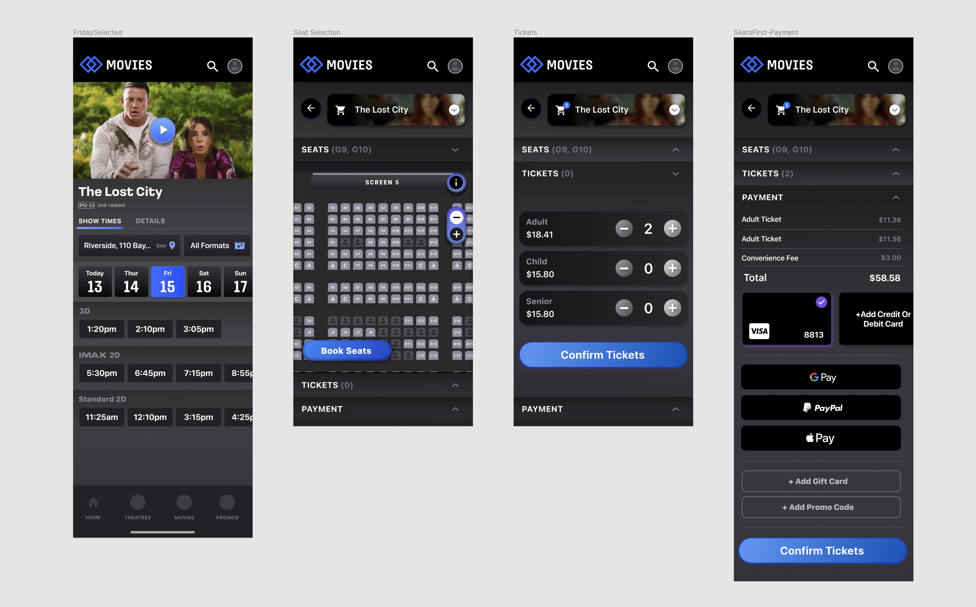
Users select seats and Tickets
By combining these two screens it should make it easier for the user to complete the flow.
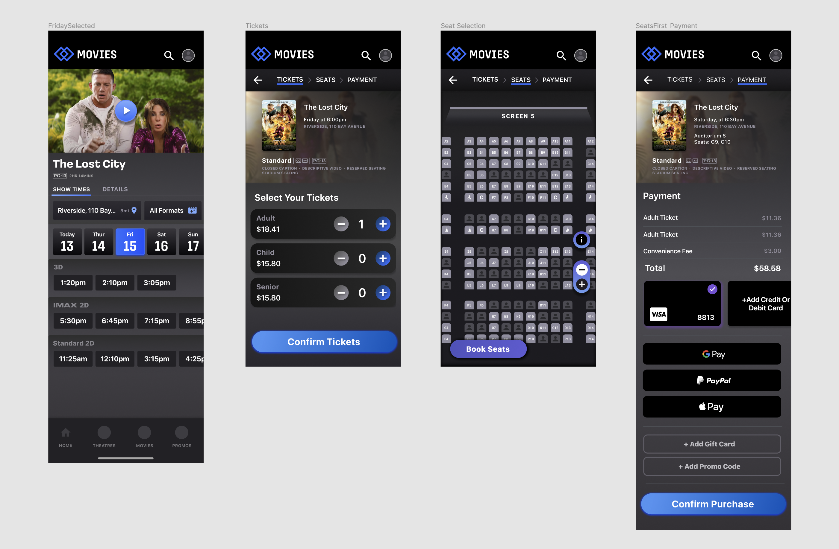
User Testing
I set up three different flows for our testsers
I tested 3 different flows:
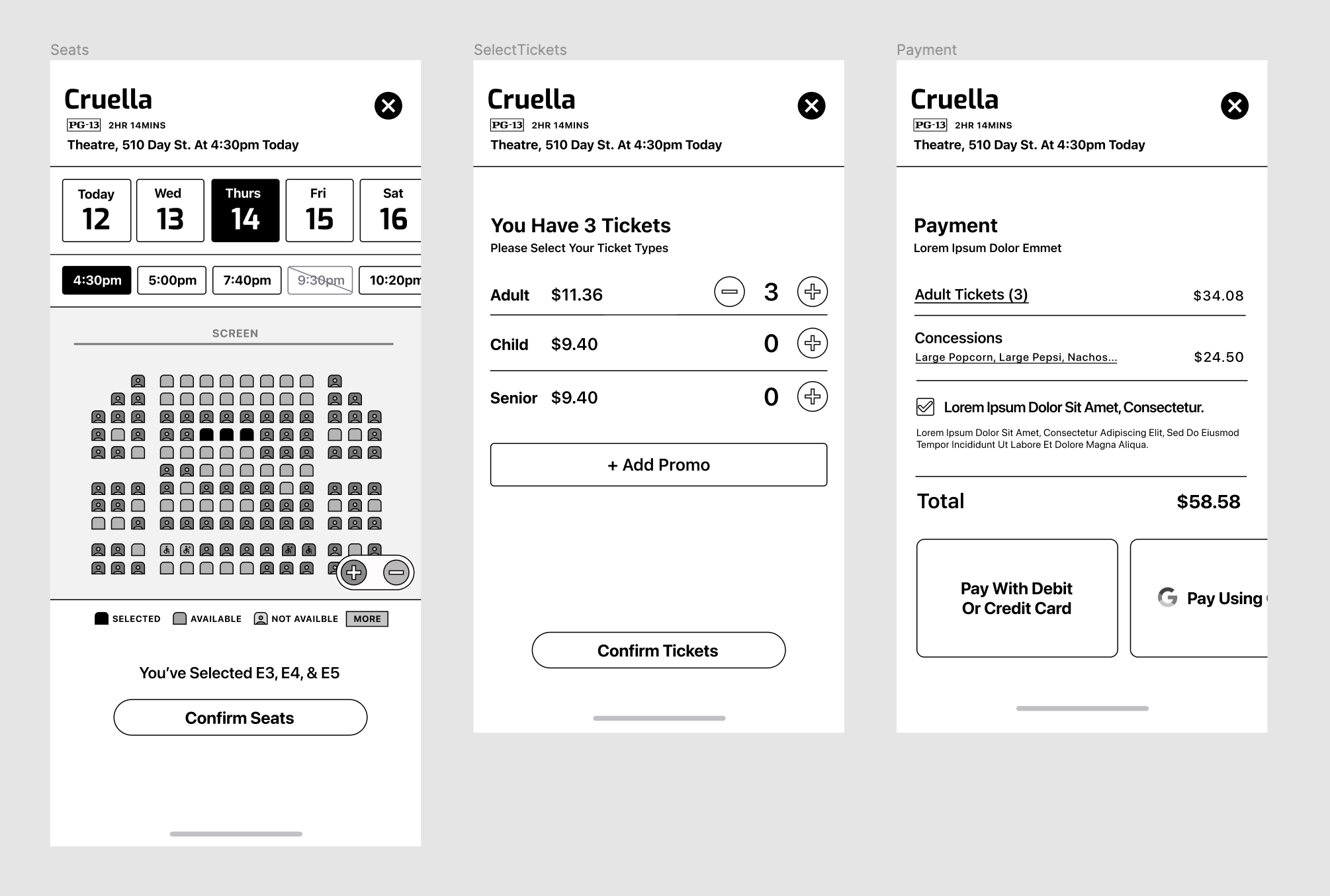
- Current Flow - The same as what we currently have
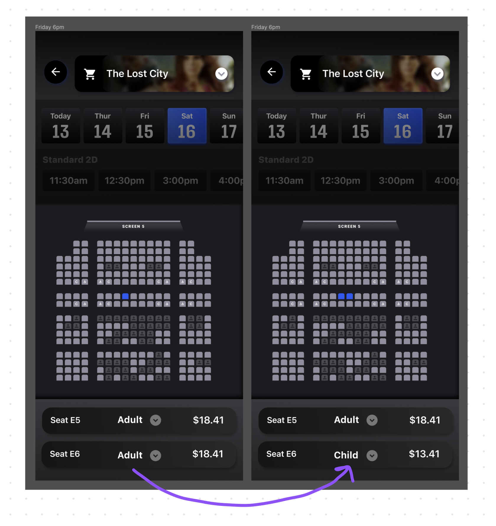
- Seats First - Showing the seat map first and giving the user the ability to change showtimes and preview different stadiums before choosing tickets.
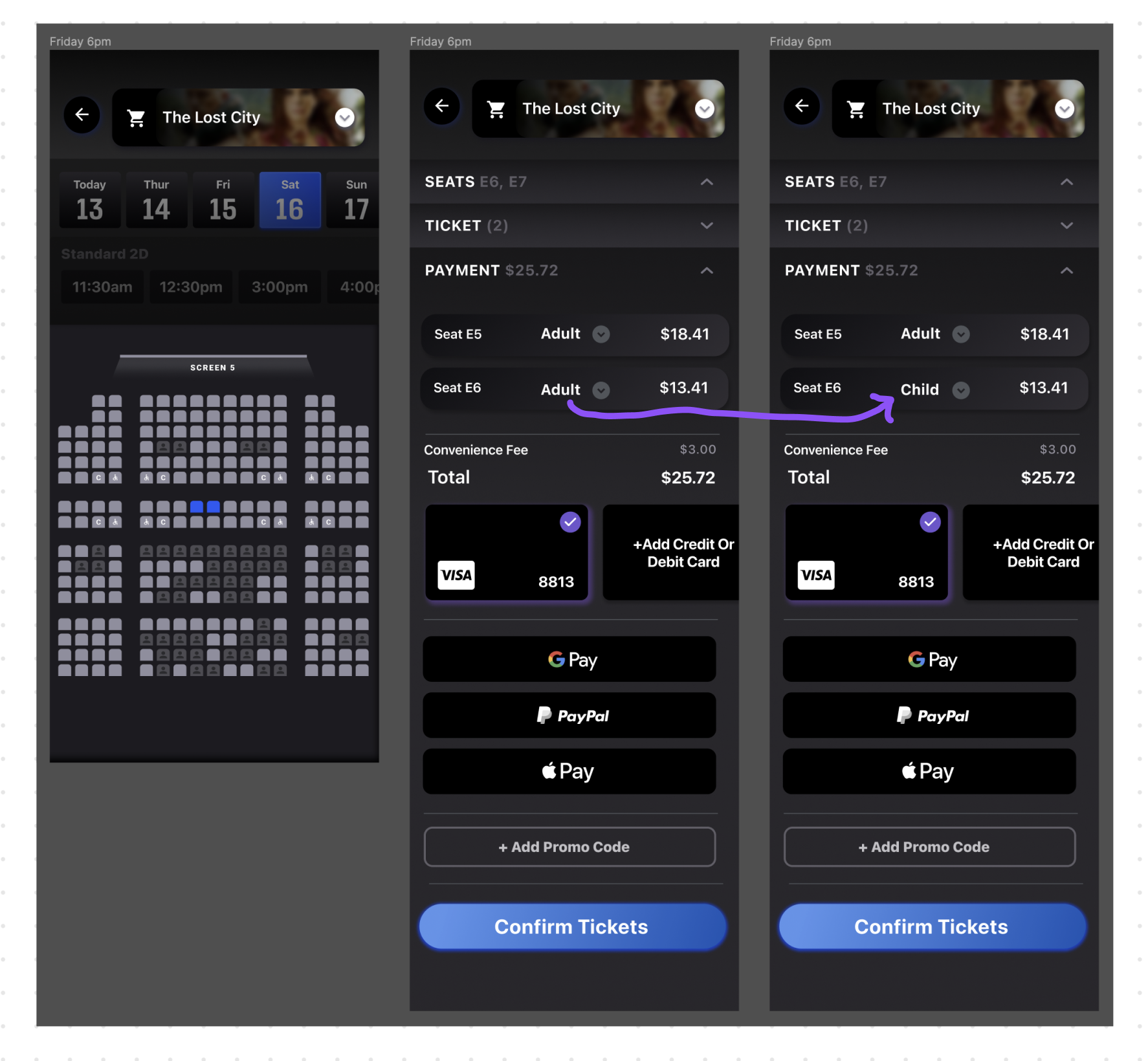
- Seats First Accordion - Same as Seats First but with an accordion.
Results
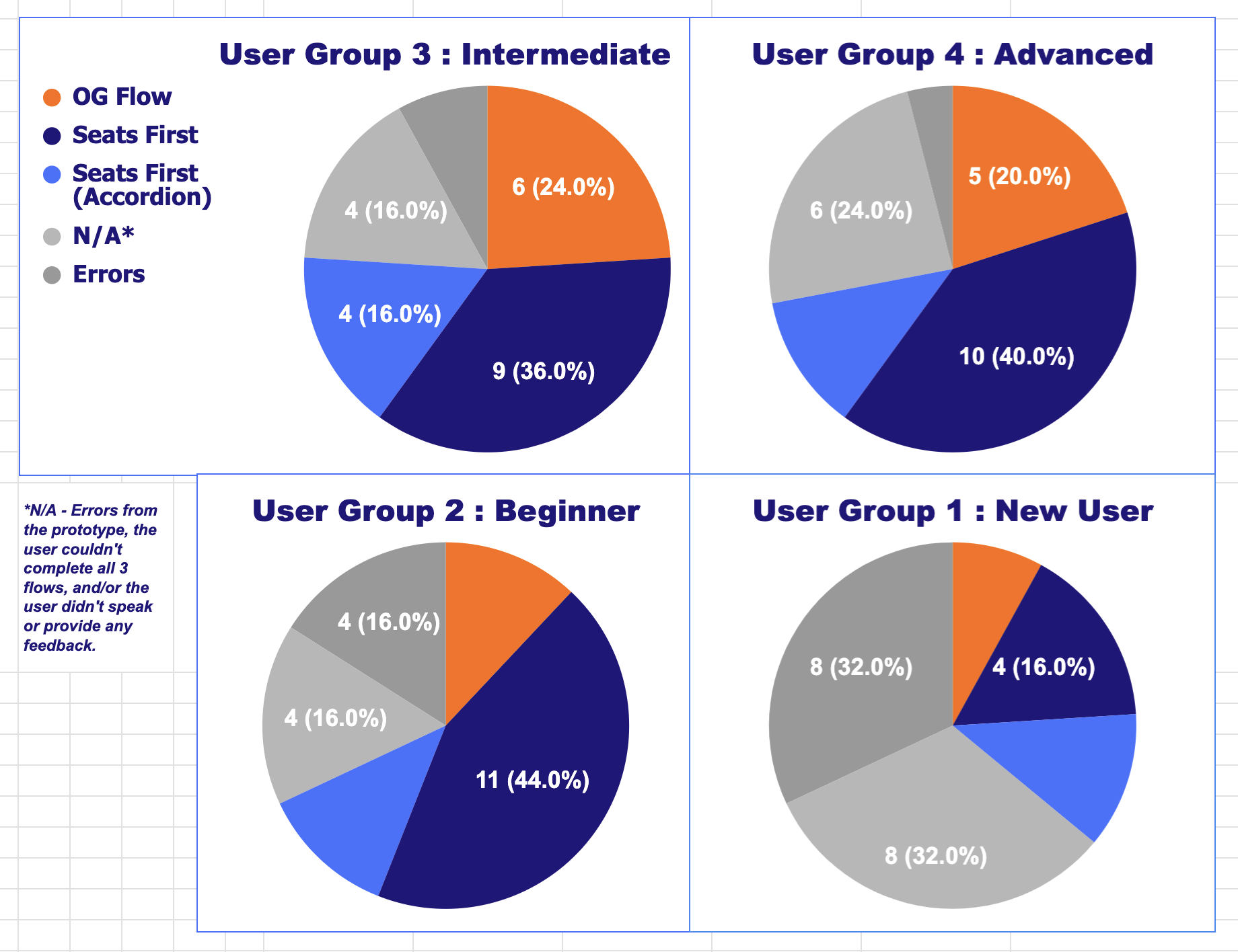
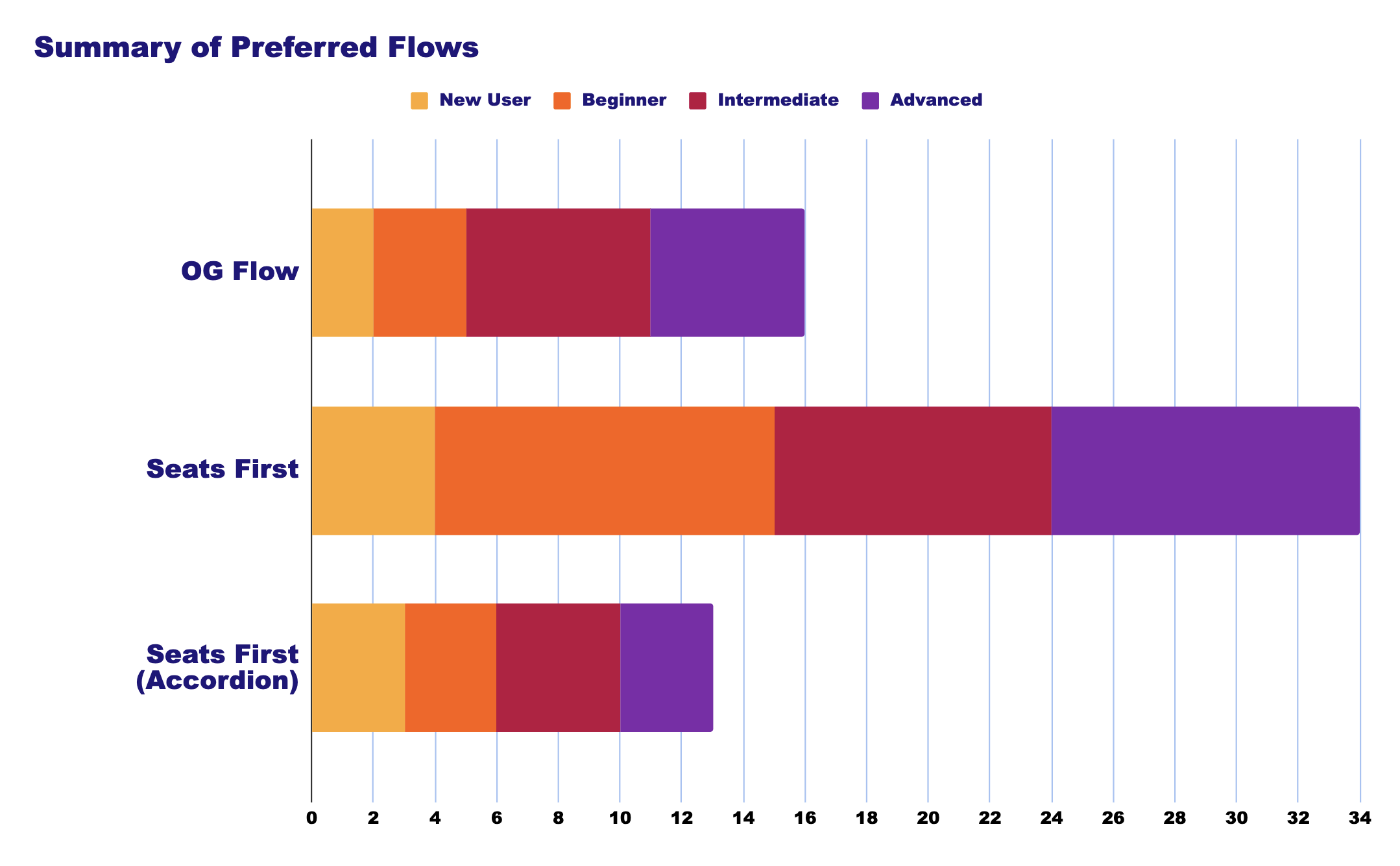
Users favored Seats First
Ultimately we found that our users preferred seeing the seatmaps first. However, we also found that our users were confused by having to select your ticket type after choosing your seat.
New Problems
Users don't distinguish between "seats" and "tickets"
The next test would be to see if users will be confused by changing out ticket types.
